Your SBOM Data Has Been Gathering Dust - Until Now

I’ve been talking about graphs for dependency analysis for a while now, and last month I got to present the idea in front of a room full of DevSecOps leaders at the DevSecOps Leadership Forum in London. The talk was called “Proactive Risk Reduction using Graph Analysis” and the reaction told me something important: people are exhausted.
Exhausted by vulnerability noise. Exhausted by point-in-time SBOM scans that produce a report nobody acts on. Exhausted by being told to “just patch it” when the blast radius of a single zero day spans 16 services and three levels of transitive inheritance.
So I built something.
SBOM-Graph is now open source, and this post is going to show you what it can do, and why I think it changes the conversation from “how many vulnerabilities do we have?” to “what does our risk actually look like, and what do we do about it?”
The Problem Nobody Wants to Say Out Loud
Let me ask you something. Who in your organisation is actually using your SBOM data for engineering decisions?
If the answer is “not really anyone,” you’re not alone. Most teams generate SBOMs because compliance or tooling requires it, and then the data sits there. Maybe it goes into a dashboard. Maybe someone reviews it quarterly. But day-to-day? It’s inert.
Here’s the thing though: that data is a goldmine. You just need the right lens to look at it through.
Let me give you a concrete example of why that lens matters. Imagine your SCA (Software Composition Analysis) tool tells you that you have 2,500 vulnerabilities. That number will make a lot of people want to close the tab and pretend they never saw it. But let’s pause for a moment and reason through what that number actually represents.
Say you have 20 internal applications. Each of them uses the same 5 internal libraries. Each of those internal libraries depends on the same 5 external libraries. Each of those external libraries has 5 known vulnerabilities. A flat SCA report sums all of that up across every project and gives you 2,500. Technically correct, and completely misleading.
Now look at it through a graph. Those 5 external libraries have all been patched. No breaking changes. How many work items do you actually have? 25, one dependency file update per internal library. If there are breaking changes but your internal libraries can absorb them without propagating anything upstream, you’re still looking at 20 small updates and potentially 5 slightly more complex ones.
That’s the reframe. Not “how many vulnerabilities do we have?” but “what does the work actually look like?” And flat SBOMs cannot answer that question. Graphs can.
What Is SBOM-Graph?
SBOM-Graph ingests your Software Bill of Materials (SBOM) data and loads it into a graph database. From there, it gives you an interactive UI with visualisations and pre-built reports that let you explore your software ecosystem the way it actually exists, as a network of interdependent components with relationships, inheritance paths, and cascading risk.
There’s a built-in example database that spins up automatically so you can explore every feature immediately without any data setup. Everything below is from that example, so go try it yourself.
Let’s dig into what it surfaces.
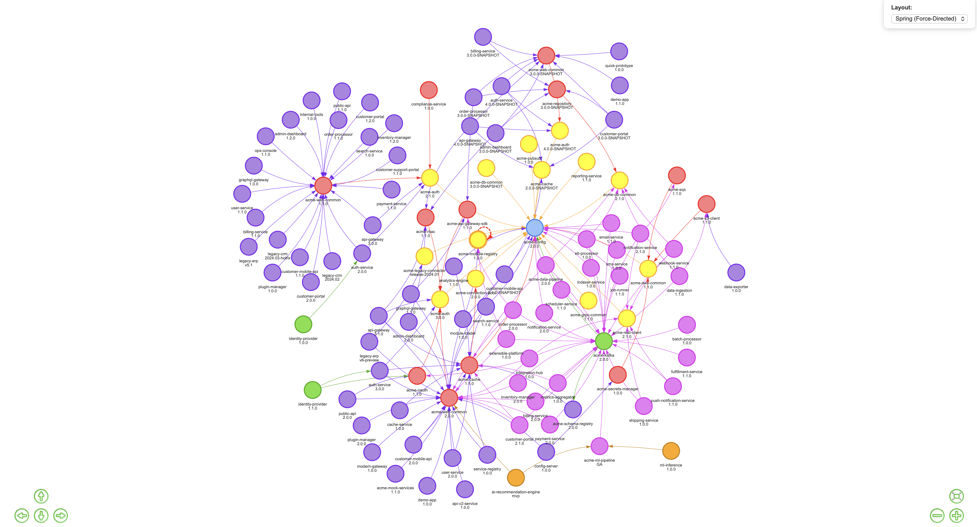
Zero Days: Stop Asking “Are We Affected?” Start Asking “By How Much?”
When PostgreSQL drops a zero day, the first question most teams ask is “which of our services uses PostgreSQL?” That’s the wrong question. The right question is: what is the full blast radius, and what are the inheritance paths?
SBOM-Graph answers that in seconds with a graph view showing the entire propagation tree.
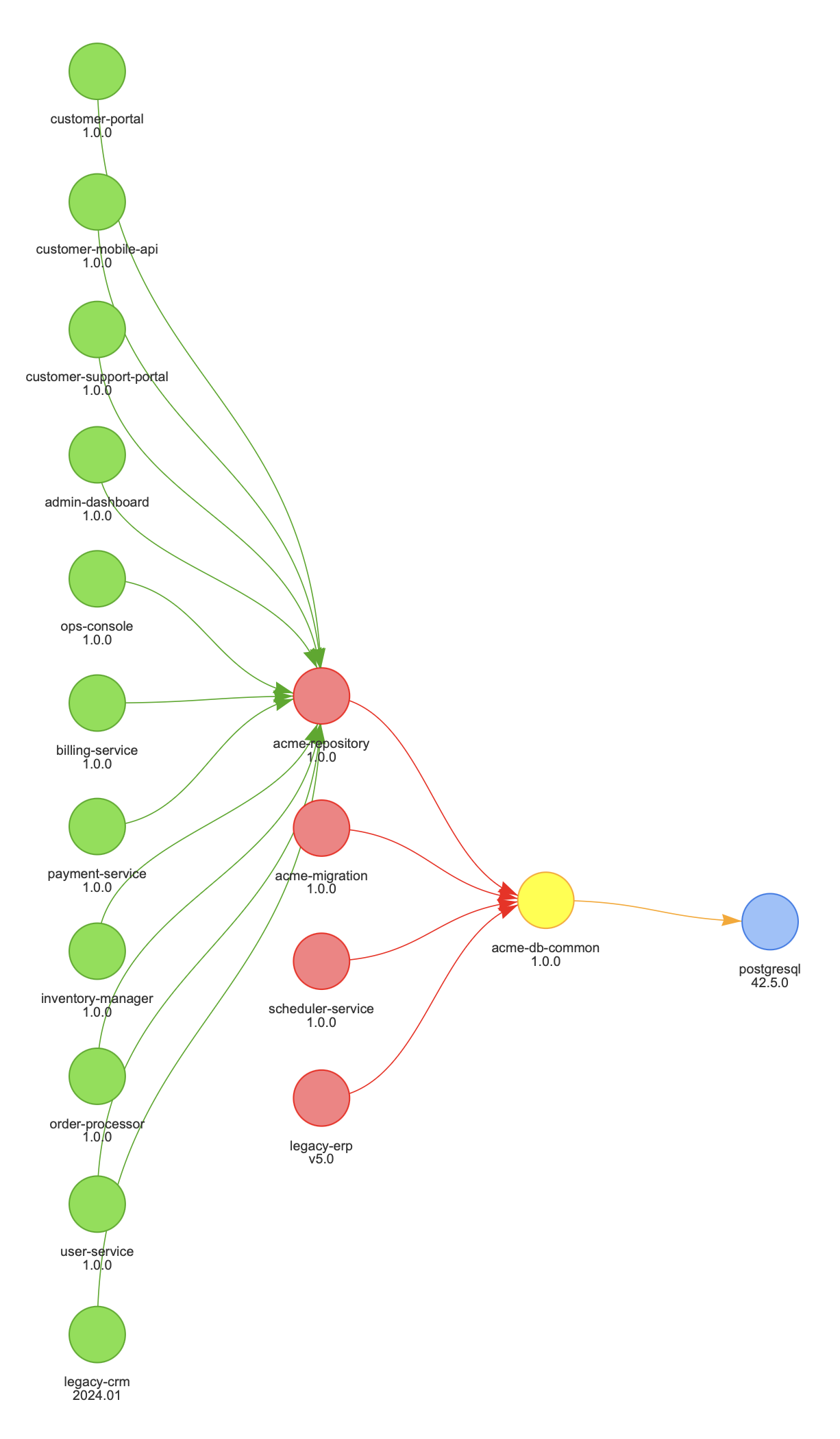
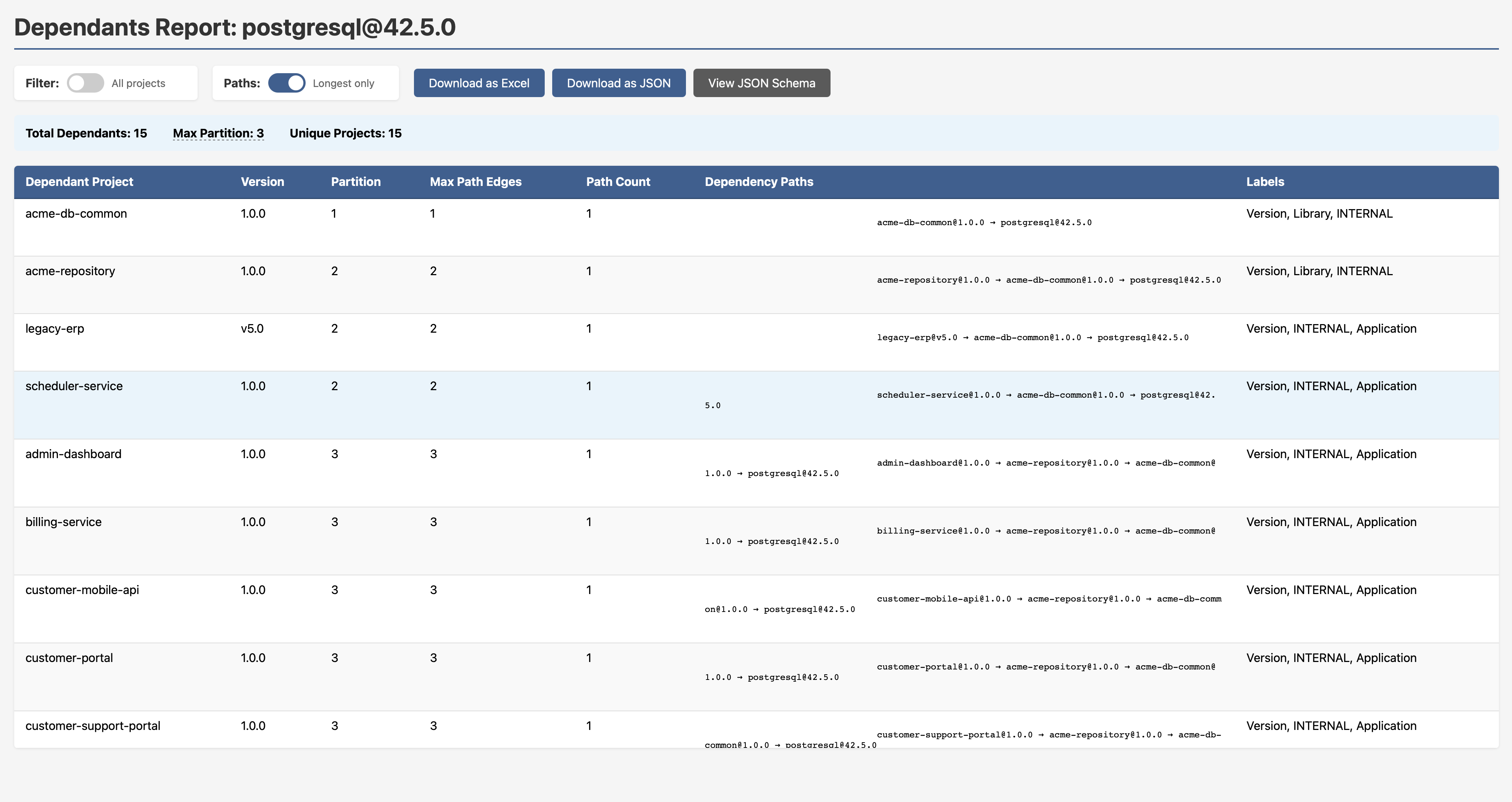
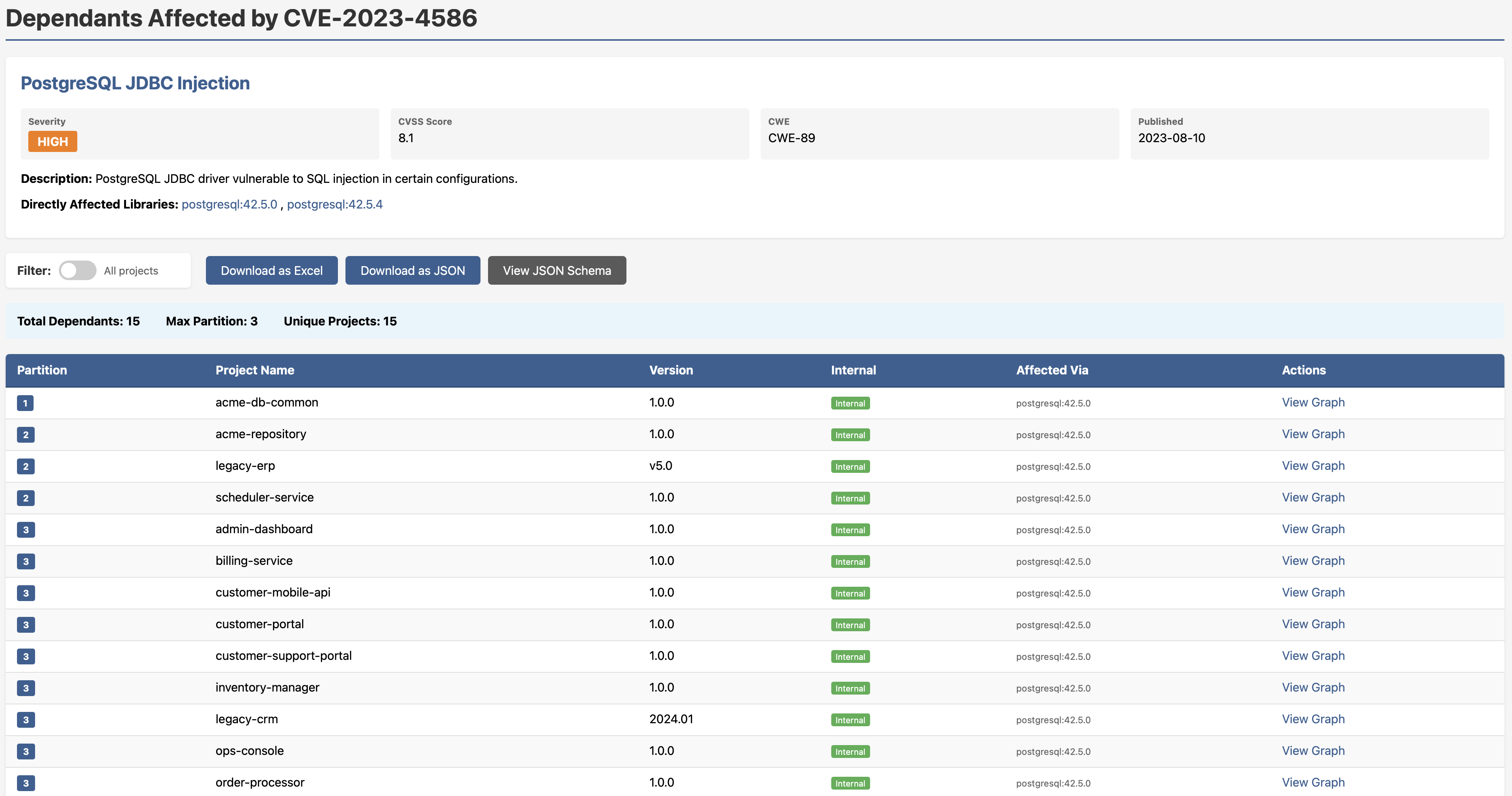
In the example above, 15 projects are affected by a PostgreSQL JDBC injection vulnerability (CVE-2023-4586, CVSS 8.1). But here’s the insight that matters: they all inherit the vulnerability through a single internal component: acme-db-common. That means there may be one fix point, not fifteen. You know who needs to act, in what order, and whether breaking changes upstream are a concern before you’ve written a single line of a patch.
Want that as an actionable report with full dependency paths, partition depth, labels and export options? One click.
Note to security engineers: This is the difference between CVE chasing and exposure management. Graph traversal doesn’t just tell you what’s affected — it tells you how it’s affected and through what chain. That’s the information you need to prioritise intelligently.
All Your Vulnerabilities — Consolidated, Ranked, Drillable
The All Vulnerabilities report gives you a single view across your entire ecosystem: every CVE, severity badge, CVSS score, CWE classification, publication date, and all affected versions. No toggling between tools. No cross-referencing spreadsheets.
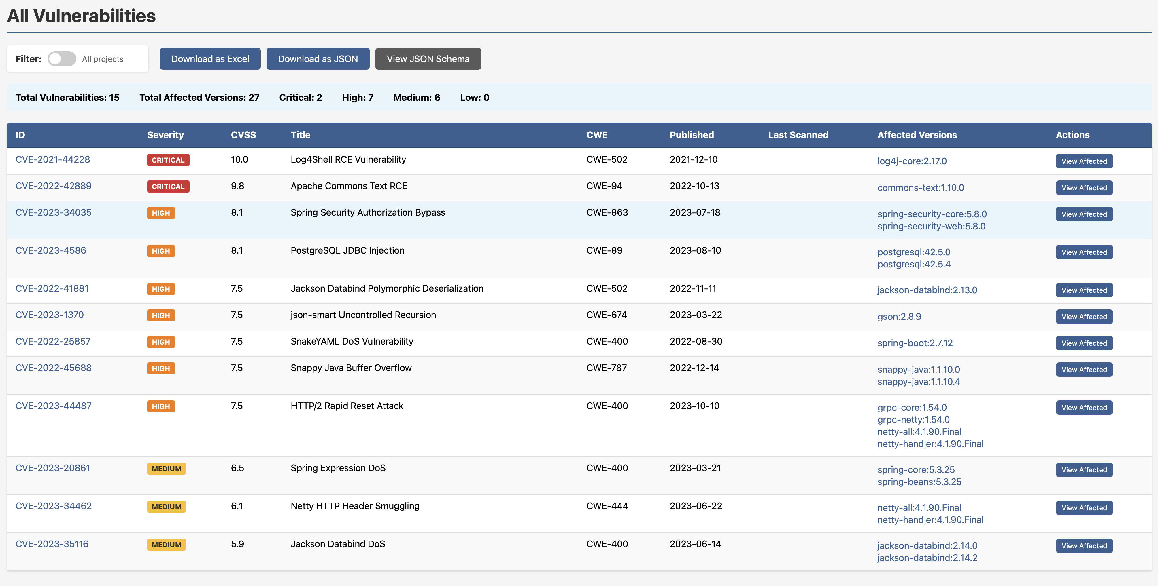
Two criticals, seven highs, six mediums, you know where you stand. Drill into any CVE and you get the full dependants breakdown: which projects are affected, exactly which version of the vulnerable library they’re pulling, and a direct link into the graph view.
Know Your Core Libraries — Before a Crisis Forces You To
One of the most underrated questions in dependency management is this: which internal libraries does everything else depend on? If that library has a bad day, how much of your ecosystem goes with it?
The Internal Library Centrality report surfaces exactly this. It ranks every internal library by:
- inDegree — how many projects depend on it (impact)
- outDegree — how many dependencies it itself has (exposure)
High inDegree with high outDegree is your highest-risk profile. That’s the library that’s widely relied upon and pulls in a lot of external risk itself. That’s the one you want to know about before something goes wrong.
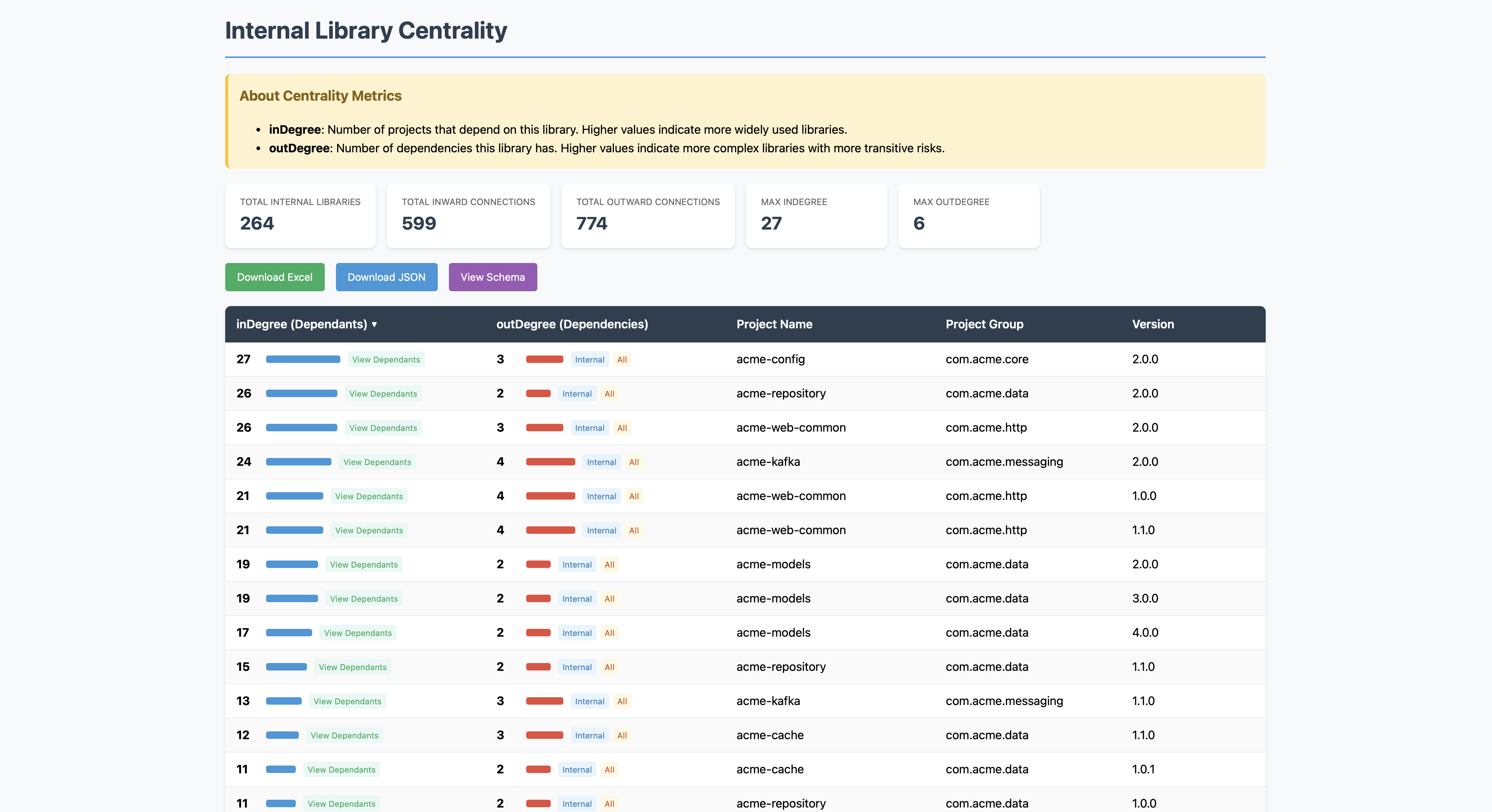
Click “View Dependants” on any row and you get a live, interactive graph showing every project that depends on that library and how they connect.
This is what I mean when I talk about inward centrality affecting impact, and outward centrality affecting exposure. These aren’t abstract concepts, they’re visualised and clickable.
Cyclic Dependencies: Seeing the Problem Is Half the Battle
Cyclic dependencies are one of those issues that everyone vaguely knows exist but nobody has a great way to surface. They complicate build ordering, make refactoring painful, and tend to accumulate silently over time as codebases grow. In SBOM-Graph, they’re rendered visually, those dotted circular lines in the graph are the giveaway.
Need a clean report instead? One click.
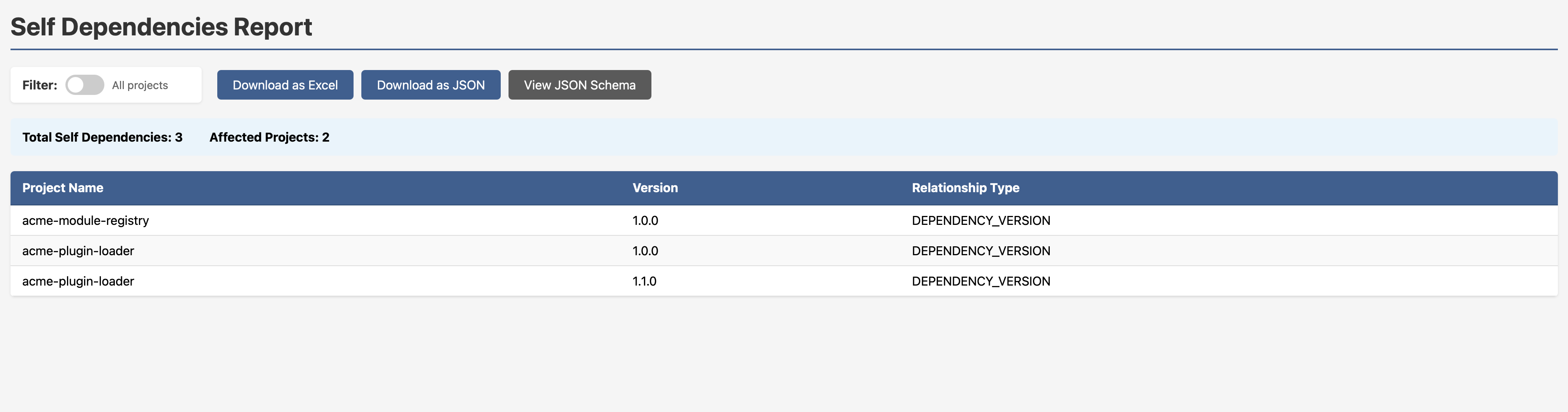
SNAPSHOT Dependencies in Production: A Favourite Anti-Pattern
Someone at some point released a SNAPSHOT dependency into a production build path. Maybe they meant to clean it up. Maybe they forgot. Maybe nobody ever noticed. The SNAPSHOT Dependencies Report finds them all.
In the example dataset: 38 total SNAPSHOT dependencies across 14 affected applications. Every row shows you the application, its version, the SNAPSHOT dependency, and the dependency version. You don’t have to go looking, it’s just there.
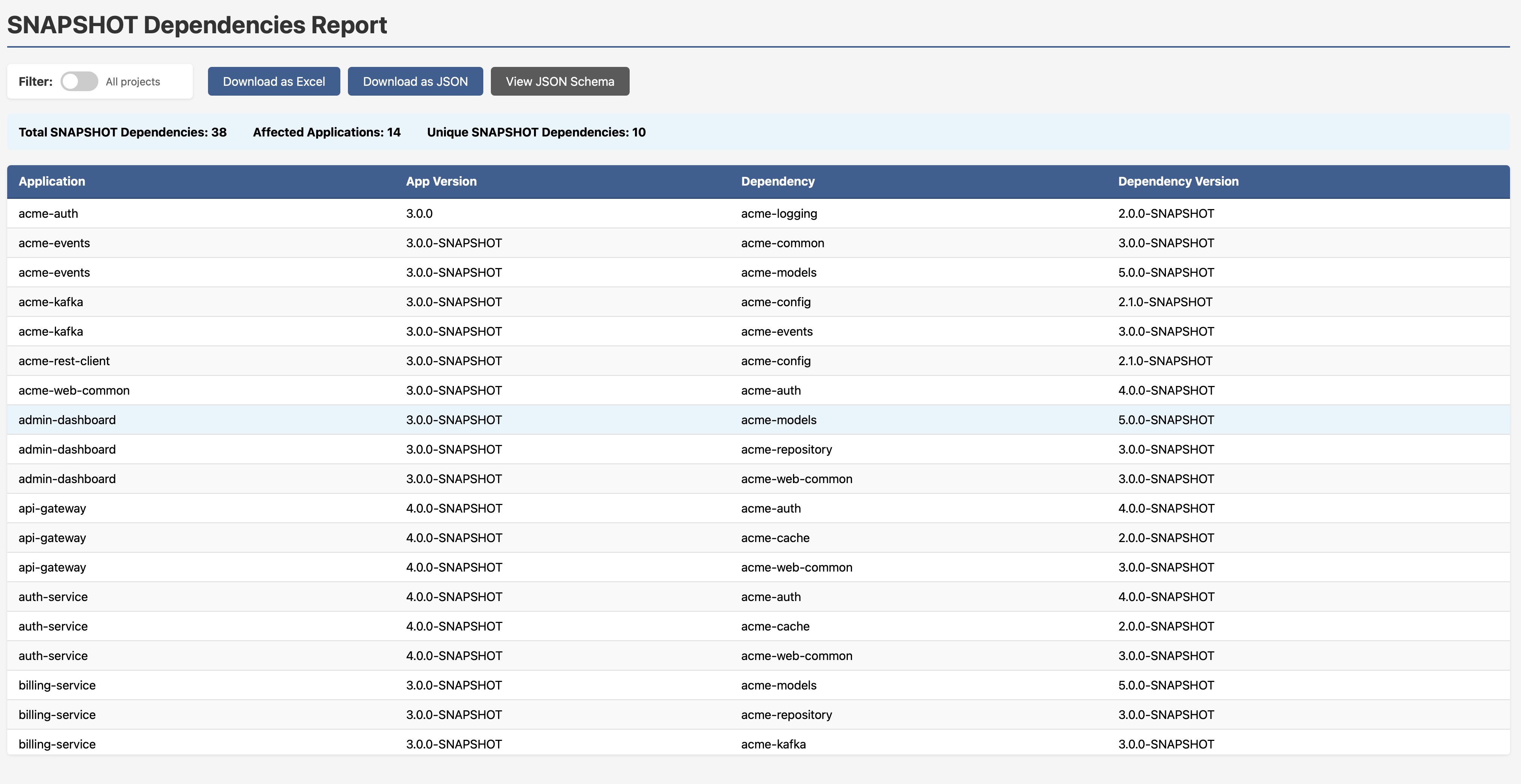
Those suffixes scattered through the dependency web are hard to miss once you’re looking for them on any of the graphs.
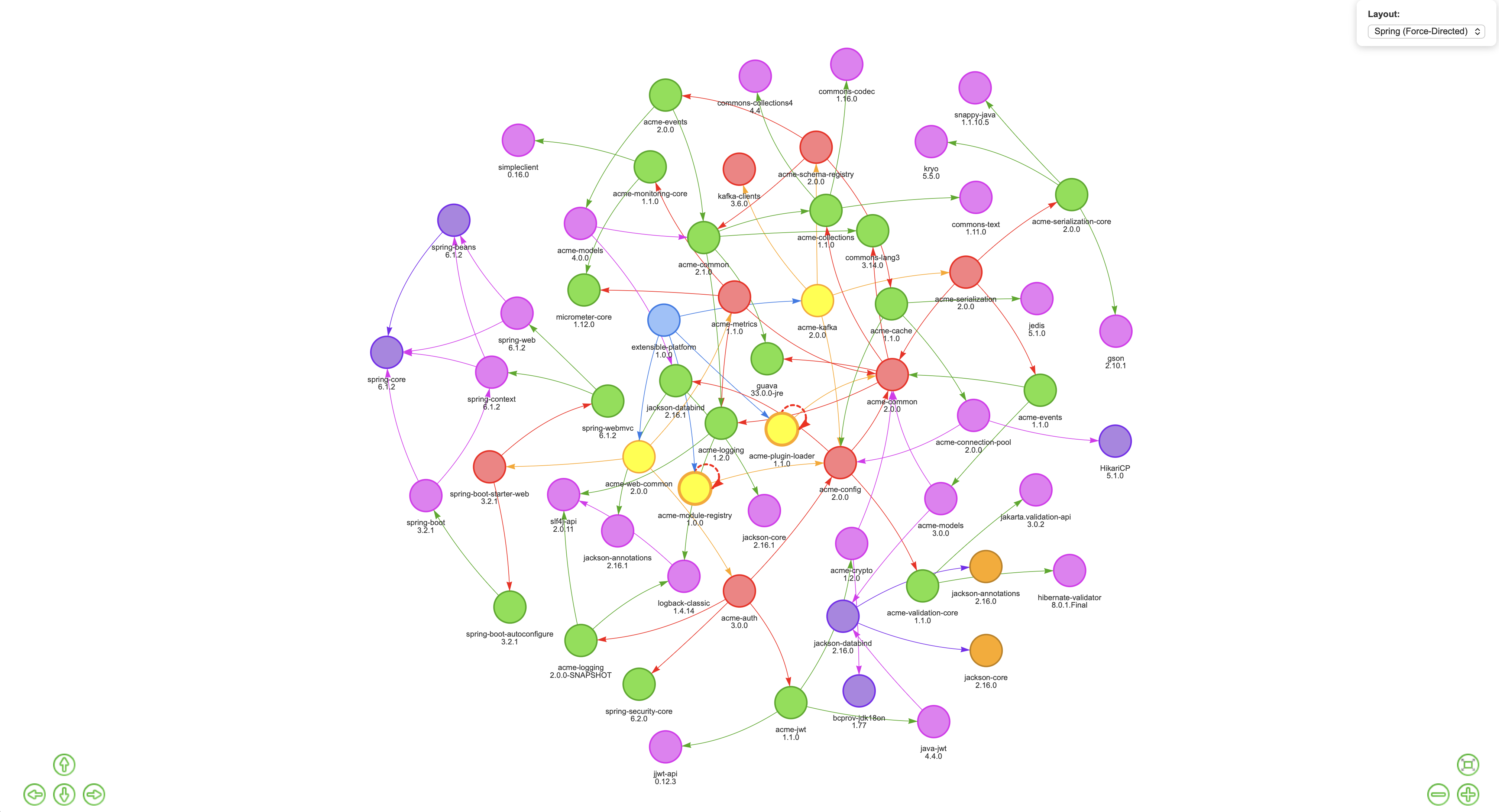
Dependency Pinning: The Version Conflict You Didn’t Know You Had
Here’s a pattern that causes subtle, maddening runtime failures. A team pins a dependency to a specific version somewhere upstream, often to fix a vulnerability. Fine, reasonable short-term fix. But then they never unpin it. Time passes. The rest of the ecosystem moves on to a newer version of the same library, but that pinned upstream dependency is still quietly dragging in the old one. Now you have two versions of the same library coexisting in your runtime. Methods differ. Interfaces shift. Something breaks in a way that’s very hard to trace.
This is known as the diamond dependency problem, and it’s one of the harder things to spot with flat tooling.
SBOM-Graph makes it immediately visible. In the graph below, look closely and you’ll see acme-events 1.1.0 and acme-events 2.0.0 both present, as well as multiple versions of acme-models coexisting in the same ecosystem. One version is what your projects declare directly. The other is being dragged in by an upstream dependency that pinned it and never let go.
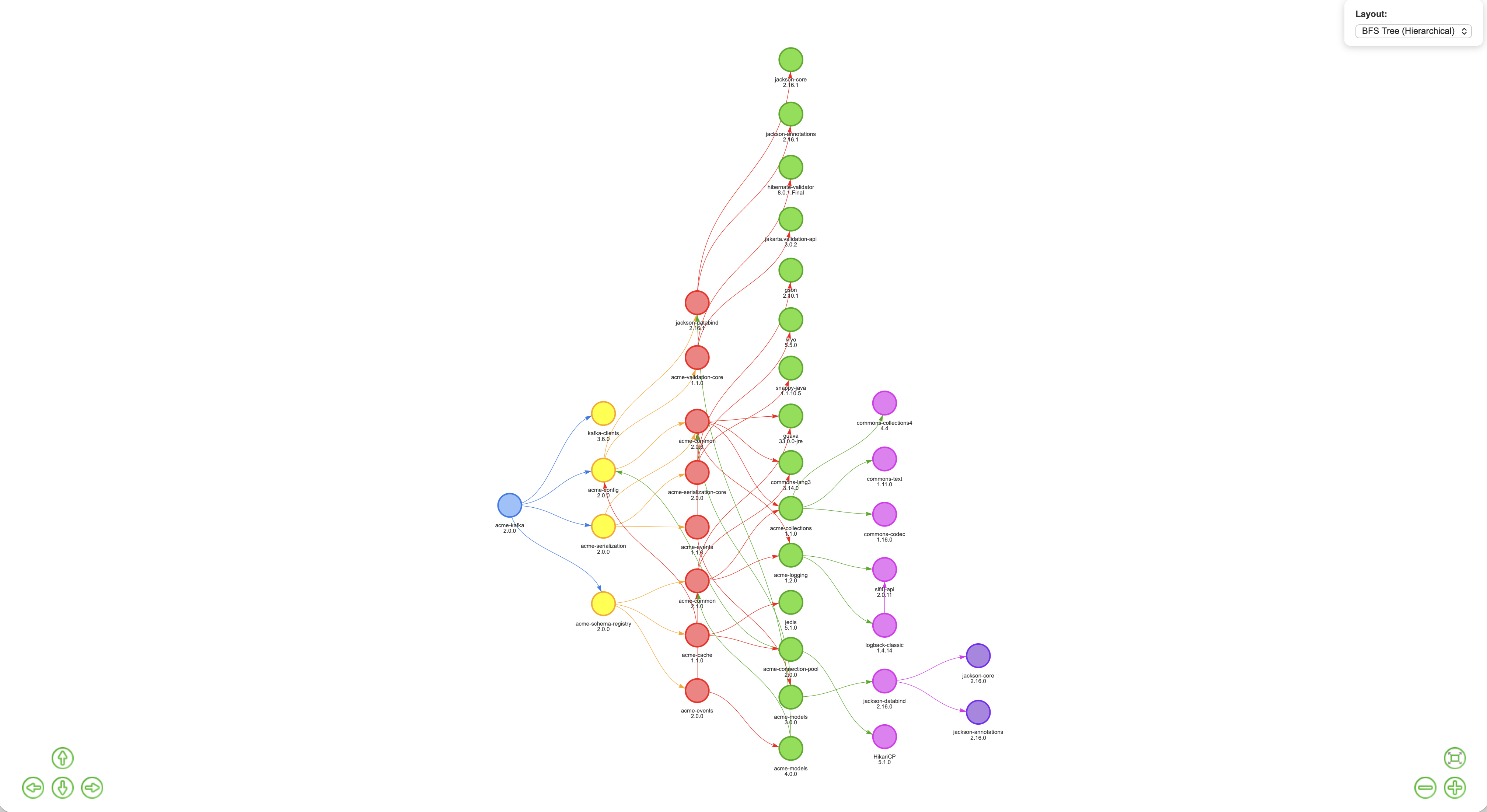
But here’s where it gets actionable. The Diamond Dependency Analysis report (available at /reports/multi-version-sources/{project}/{version}) shows the scan sources for every version of a conflicting library, so you can trace exactly which upstream dependency is doing the pinning. No more guesswork. You know who pinned it, when, and who’s pulling it in transitively. That’s the information you need to go and fix it cleanly.
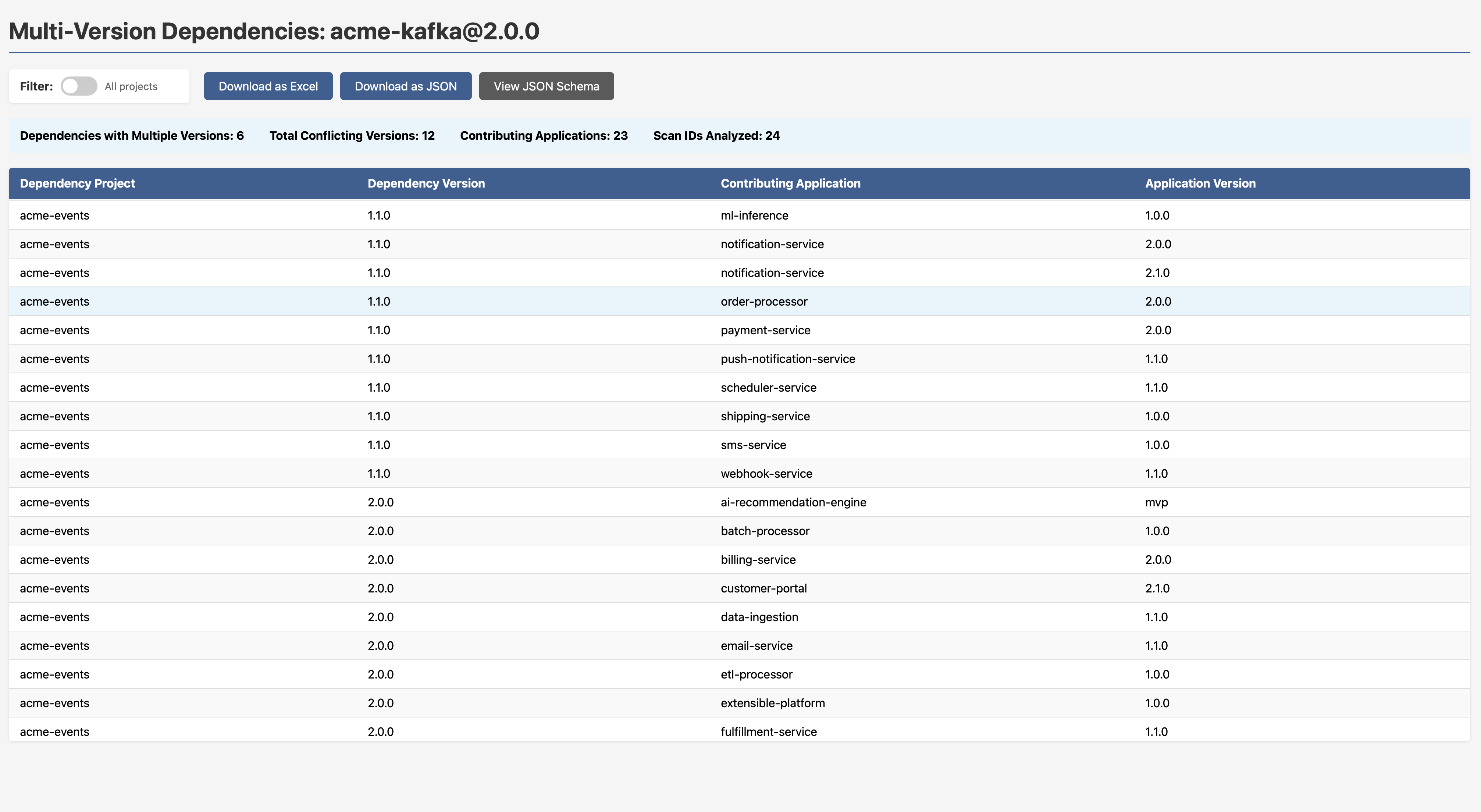
Note to engineering leads: Version conflicts like this are often invisible until something breaks in production. If your SCA tool reports on vulnerabilities in a library but doesn’t tell you that two versions of it exist in your dependency graph simultaneously, you can’t be confident which one is actually running.
Non-SemVer Versioning: Governance That Actually Works
If your organisation has standardised on Semantic Versioning, you need a way to find who isn’t following it. build-123, release-2024.01, v3-beta, GA, mvp, prototype-2, these all appear in the example dataset, and the report doesn’t just flag them; it tells you why each one fails the check.
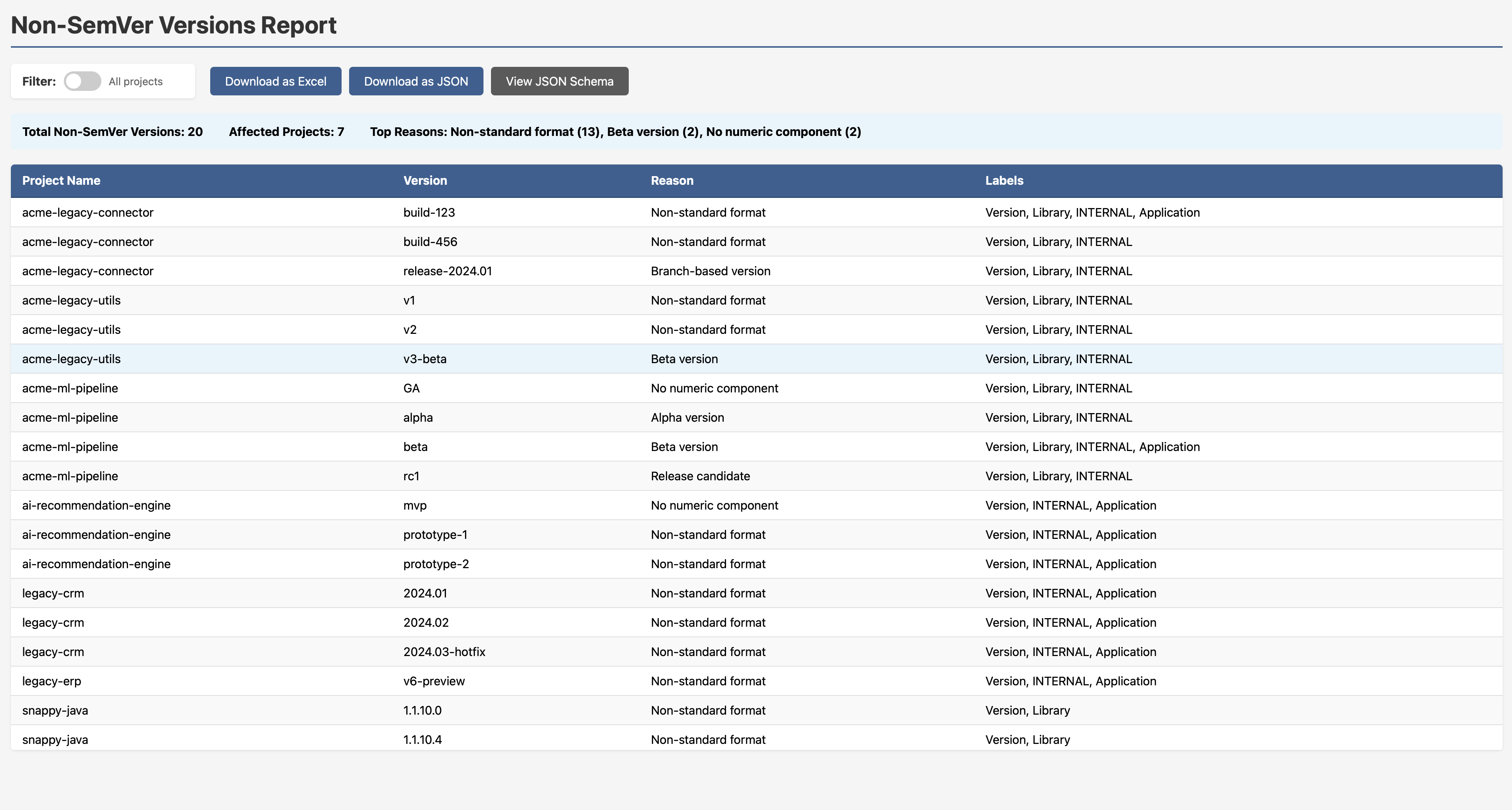
This is exactly the kind of governance visibility that engineering leads need but rarely have a clean way to get.
Every Report is Exportable
Each report in SBOM-Graph ships with three export options:
- Download as Excel — for stakeholders who live in spreadsheets
- Download as JSON — for downstream tooling and automation pipelines
- View JSON Schema — so you can integrate the data programmatically
This isn’t a walled garden. The data flows where you need it.
The Bigger Picture: Threat Modeling Your Dependencies
Here’s the thought I kept coming back to while building this. The Threat Modeling Manifesto says we ask four key questions:
- What are we working on?
- What can go wrong?
- What are we going to do about it?
- Did we do a good enough job?
Apply those to your software ecosystem:
- An interconnected web of internal and third-party components.
- One of them has a history of exploitable vulnerabilities, and it sits at the heart of your system.
- Find a less risky alternative, or at minimum understand the full inheritance chain before you’re under pressure.
- If the effective security posture of your ecosystem, accounting for all inherited risk, is still strong, you’re in good shape.
What SBOM-Graph gives you is the ability to actually answer those questions. Not in theory. In a browser, with real data, in minutes.
As I put it during the DLF talk: who actually uses their SBOM data for engineering? The goal is for that answer to change.
Getting Started
Clone the repo and run it. If you don’t pass in a company database name, an example database spins up automatically, all the screenshots in this post use it.
git clone https://github.com/mimecast/sbom-graph
The full feature specification, including what’s already implemented and what’s on the roadmap, lives in the SPECIFICATION.md.
Final Thoughts
The supply chain security conversation has been dominated by CVE counts for too long. CVEs are a signal, not a strategy. What we need is exposure management, understanding not just what vulnerabilities exist, but where risk is concentrated, how it propagates, and what the blast radius looks like before the zero day drops.
SBOM-Graph is my contribution to that conversation. It’s open source, it ships with example data, and there’s a long roadmap ahead. If the problem resonates with you, I’d love for you to try it, raise issues, or contribute.
Let’s make our software ecosystems a little safer - one graph query at a time.
Stay tuned!
You may also like:

SLSA and Provenance: Your SBOM Says What's Inside, This Says Where It Came From
The Blast Radius runs on one conviction: prefer...

Data Protection and Data Privacy - Part 2 of 2
From Principle to Practice: Privacy in the Real...

Threat Modeling Your Dependencies - Part 2
Mitigating Third-Party Component Risk: Swapping the Cancer for...

Threat Modeling Your Dependencies - Part 1
How One Bad Library Can Poison Your Entire...