Threat Modeling Your Dependencies - Part 1

How One Bad Library Can Poison Your Entire Ecosystem
Imagine you have an ecosystem of thousands of applications, each with its own web of internal and third-party dependencies. Now imagine a single vulnerability drops in one of those third-party libraries.
How bad can it be? Let’s do the maths.
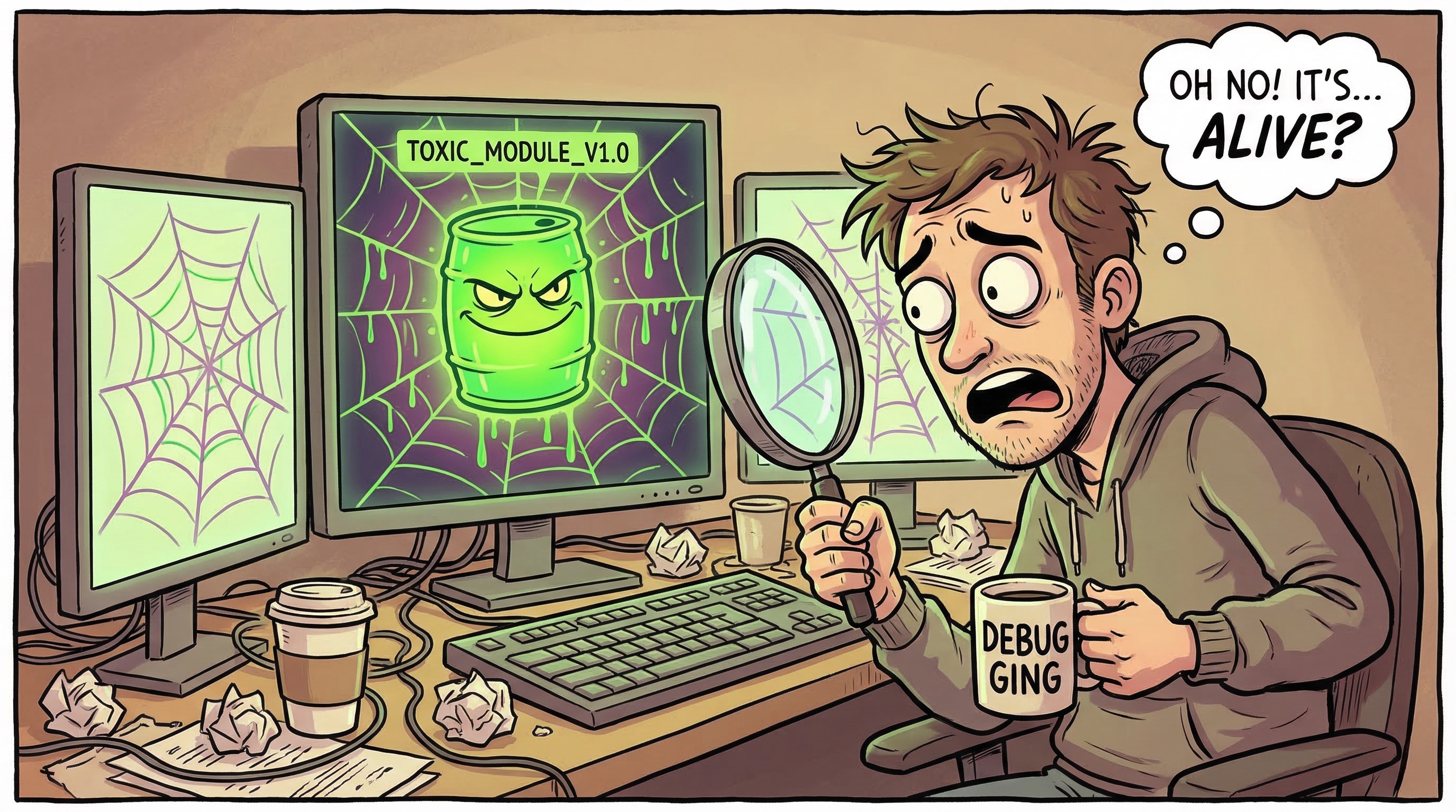
That library has 5 direct dependants. Each of those has 5 dependants of its own. And each of those has 10 dependants. That one component has just poisoned 250 projects. It spreads like a cancer through your entire ecosystem.

Now here’s where it gets truly ugly. If that library is shipping a new vulnerability once a month, and some libraries absolutely do, then over a single year you’re dealing with 3,000 vulnerability events. All from one dependency.
Ask yourself: are all your third-party libraries always patched quickly? Or does it take weeks, sometimes months, before a vulnerability is addressed? You’ve probably had occasions where you’ve had to put compensating controls in place just to buy time. You’ve probably had to raise waivers. And every one of those waivers is a formal acknowledgement that you know you’re exposed and you’re choosing to accept the risk because you have no alternative.
That’s not a comfortable place to be. But here’s my concern, most organisations don’t have a systematic way to understand how much of their ecosystem is in that state at any given time.
The Metrics That Actually Matter
When you start pulling at this thread, four metrics emerge that tell you whether a dependency is a ticking time bomb:
- Vulnerability frequency — How often does this component ship CVEs? Once a year is one thing. Once a month is an alarm bell.
- Mean Time to Remediate (MTTR) — When a vulnerability is disclosed, how long does it take the maintainers to ship a fix? And critically, how long does it then take you to consume that fix and roll it out across your ecosystem?
- Open vulnerability count — How many known, unpatched vulnerabilities exist in the component right now? A high count tells you the maintainers are overwhelmed, under-resourced, or both.
- Ecosystem impact — How many of your applications and internal libraries depend on this component, directly or transitively?
Now here’s the thing, these metrics don’t exist in isolation. If vulnerability frequency is high and MTTR is long, you end up with a growing pile of open vulnerabilities. And if that component sits deep in your dependency graph with hundreds of dependants, every one of those unpatched vulns is multiplied across your estate.
But it goes further. If most of these metrics look bad, it’s reasonable to question whether the security practices of the organisation producing that library are up to scratch. Are they running SAST? Do they enforce code review? Is branch protection enabled? You might want to check.
You also want to understand whether the component is still being actively maintained. An abandoned library with known vulnerabilities and no prospect of a fix is a very different risk proposition to one where the maintainers are slow but engaged.
All the while, you’re doing additional work that wasn’t planned. You’re vulnerable. And you’re burning engineering cycles on compensating controls instead of shipping features.
The Dependency Graph as a Threat Model
In your ecosystem, you have lots of interconnected components that depend on one another. This forms a directed graph, and the direction matters.
An application has dependencies but doesn’t have dependants (nothing depends on it, it’s the end of the line). A leaf library has dependants but may have no dependencies of its own. Between them sits a web of internal libraries and shared components that have both.

You can think of the graph as flowing from applications on the left, through a series of internal components, to leaf libraries on the right. The scores propagate in the opposite direction, from the leaves back to the applications.
Two properties of this graph matter enormously for threat modelling:
Inbound connections = impact. The more things that depend on a library, the higher its blast radius when something goes wrong. A logging library used by 200 internal components is a very different risk to a niche codec used by one application.
Outbound connections = exposure. The more dependencies a library has, the more exposed it is to inbound vulnerabilities from its own supply chain. A component with 30 transitive dependencies has 30 potential sources of inherited risk.
This is where traditional vulnerability management falls short. It tends to treat each CVE as an isolated event, scan, find, patch, close the ticket. But when you look at the dependency graph, you realise that a CVE isn’t a point event. It’s a wave that propagates through the graph, and the shape of that graph determines how much damage it does.
The Supply-Chain Trust Score
So how do we move from “we know this is a problem” to “we can quantify and track it”? This is where the Supply-Chain Trust Score comes in.
The trust score provides a single, evidence-based rating from 0 to 10 for every package in your dependency graph. It aggregates data from four external sources:
- OpenSSF Scorecard — 18+ security-practice checks covering branch protection, code review, SAST, fuzzing, dangerous workflows, and more
- OSV Database — Vulnerability count, severity distribution, and mean-time-to-fix
- Sonatype OSS Index — Proprietary vulnerability intelligence and remediation guidance
- deps.dev — Project health signals, advisory counts, scorecard data, and activity indicators
Scoring Categories
The composite score is computed across four weighted categories, each normalised to 0–10:
| Category | Default Weight | What It Measures |
|---|---|---|
| Security Practices | 30% | Branch protection, code review, SAST, fuzzing, dangerous workflows |
| Vulnerability Profile | 35% | Open CVE count and severity, fix rate, mean time to remediate |
| Maintenance Health | 20% | Recent commit activity, contributor count, maintenance signals |
| Supply-Chain Hygiene | 15% | Pinned dependencies, signed releases, CI tests, packaging practices |
When a data source is unavailable for a category, the remaining sources are re-weighted proportionally so the score still reflects the best available evidence.
What Happens When Sources Disagree?
This is worth addressing head-on, because it will happen. OpenSSF Scorecard might report that a project has strong security practices, branch protection enabled, code review enforced, SAST running, while OSV shows a steady stream of CVEs.
These aren’t necessarily contradictory. A well-maintained project can still ship bugs. What it tells you is that the maintainers are likely to fix things quickly even if vulnerabilities are found frequently. The scoring model handles this naturally: the Security Practices category will score high, the Vulnerability Profile will score lower, and the composite reflects both realities.
However, the opposite scenario, low practice scores but few reported CVEs, should raise a different concern. It might mean nobody is looking for vulnerabilities, not that they don’t exist. This is where the confidence level becomes important.
Confidence: How Much Should You Trust the Score?
A confidence level from 0 to 1 is reported alongside every score. This reflects how much evidence was available to compute it.
A score of 7.5 with confidence 0.9 means you have rich data from multiple sources and the score is reliable. A score of 7.5 with confidence 0.3 means you’re working with sparse data, maybe only one source responded, or the project has very little public activity to assess.
I’d recommend treating any score with confidence below 0.5 as effectively “unknown” for decision-making purposes. Flag it, investigate it, but don’t let a high-scoring, low-confidence component sail through your risk assessments unchallenged. The absence of evidence is not evidence of absence, especially in security.
Inherited Risk: Why a Library’s Own Score Isn’t Enough
Here’s the concept that makes this approach genuinely useful. A library scoring 9/10 that depends on a library scoring 2/10 is far riskier than its own score suggests. The direct score only tells part of the story.

The trust score system computes an effective score that reflects aggregate risk through the entire transitive dependency tree:
effective_score(v) = α × direct_score(v) + (1 − α) × inherited_score(v)
Why α = 0.4?
The default value of α is 0.4, which means a package’s own score contributes 40% and inherited risk contributes 60%. This is a deliberate choice, and I want to be transparent about the reasoning.
In most ecosystems, the attack surface exposed by dependencies is significantly larger than the attack surface of any individual component. Your Auth SDK might have perfect security practices, but if its JSON parser has a remote code execution vulnerability, your Auth SDK is exploitable. The downstream consumer doesn’t care whether the vuln is in your code or your dependency, they’re exposed either way.
That said, α is tuneable. At α = 0.6, you weight a component’s own practices more heavily, which might be appropriate for leaf libraries with no dependencies of their own. At α = 0.2, you’re saying inherited risk dominates almost entirely, which might suit high-criticality applications where the transitive chain matters more than any individual component.
In practice, I’d recommend starting with 0.4 and adjusting per tier of your graph. Applications might use α = 0.3 (they’re consumers, what matters most is the quality of what they consume). Leaf libraries with zero dependencies should use α = 1.0 (they have no inherited risk, their score is their effective score).
Depth Attenuation: Does a Transitive Dependency 5 Levels Deep Still Matter?
A decay factor δ = 0.8 reduces the influence of dependencies at each level of the graph:
- Depth 1 (direct dependency): weight = 1.0
- Depth 2: weight = 0.8
- Depth 3: weight = 0.64
- Depth 5: weight ≈ 0.41
- Depth 10: weight ≈ 0.11
The intuition here is straightforward: a direct dependency is something you’ve explicitly chosen to trust. You’ve evaluated it (hopefully), you update it, you’re aware of its CVEs. A transitive dependency five layers deep is something you might not even know exists, but you’re still exposed to it.
So why attenuate at all? Why not carry full weight regardless of depth?
Because at full weight, a component at depth 10 in a broad graph would have the same influence on your score as a direct dependency, and that doesn’t reflect operational reality. In practice, a vulnerability at depth 10 is often harder to exploit (it needs to be reachable through the call chain), and the remediation path is longer and more uncertain (you depend on multiple intermediate maintainers to update). The attenuation reflects that reduced, but non-zero, practical risk.
However, I want to flag an important caveat: there are cases where depth attenuation is the wrong model. A critical vulnerability in OpenSSL is equally dangerous whether it’s at depth 1 or depth 8, because it’s directly reachable from the network. This is exactly what the minimum-path score is designed to catch.
The Weakest Link: Minimum-Path Score
The weighted average approach works well for general risk assessment, but it can mask catastrophically bad individual components. If 9 out of 10 dependencies score 9/10 and one scores 1/10, the average looks fine. But that single component might be the one that gets you breached.
The minimum-path score tracks the worst individual component on any path from an application to a leaf node. Think of it as the “weakest link in the chain” metric.
In practice, both metrics should be used together:
- The effective score tells you about the overall health of your dependency chain. It answers: “In aggregate, how trustworthy is this application’s supply chain?”
- The minimum-path score tells you about specific catastrophic risk. It answers: “What’s the single worst component anywhere in my dependency tree, and how exposed am I to it?”
I’d recommend alerting on both. An effective score below 4.0 suggests systemic supply-chain weakness. A minimum-path score below 2.0 suggests a specific component that needs urgent attention, regardless of what the aggregate looks like.
How Scores Propagate
Scores are computed bottom-up via reverse topological order through the graph. Starting from the leaf libraries (which have no dependencies, so their effective score equals their direct score), we work backwards through the graph, computing each component’s effective score based on its own score and the effective scores of its dependencies.
This means improvements propagate automatically. When a leaf library ships a security fix and its direct score improves, every component that depends on it, directly or transitively, sees its effective score improve too. The same is true in reverse: when a new CVE drops, the damage ripples upward through the graph in real time.
Trust Score Drop Alerting
When a package’s effective score falls below the alert threshold (default 4.0), the enrichment pipeline emits WARNING-level log alerts with the top 20 at-risk packages. You can configure the threshold via trustScore.alertThreshold in Helm values or the TRUST_SCORE_ALERT_THRESHOLD environment variable.
But here’s where I think most teams should go further than basic threshold alerting. Set up alerting on score drops as well as absolute thresholds. A component that drops from 8.0 to 5.5 hasn’t crossed the 4.0 threshold, but something significant has changed, a new CVE, a maintainer stepping back, a security practice being disabled, and you want to know about it before it cascades.
From Trust Scores to Business Risk
Now here’s where it gets really interesting, and where I think most supply-chain security approaches stop short.
If we associate a monetary value to the assets of each application, the data it holds, the revenue it enables, the regulatory exposure it creates, we can start to translate the effective trust score into something a CISO or a board can act on.
Consider an application that processes £50M in annual transactions. Its effective trust score is 3.1, dragged down by a poorly maintained JSON serialisation library three layers deep. The minimum-path score is 1.8. What is the risk exposure of that application?
This is where you connect the supply-chain trust score to your existing Business Impact Analysis (BIA) or data classification framework. If the application handles Tier 1 data (PII, financial data, health records), a low trust score means something very different than if it handles Tier 3 data (public marketing content).
A simple model might look like:
risk_exposure = asset_value × (1 − effective_score / 10) × data_tier_multiplier
Where data_tier_multiplier reflects the regulatory and reputational consequences of a breach: Tier 1 = 3.0, Tier 2 = 1.5, Tier 3 = 0.5.
This is deliberately simplified. A mature model would incorporate threat likelihood, exploit complexity (CVSS metrics from the vulnerability profile), and control effectiveness. But even this basic calculation gives you something most organisations don’t have: a prioritised, quantified view of supply-chain risk across your entire application estate.
You can now rank your applications by risk exposure, allocate remediation effort where it will reduce the most business risk, and, critically, report to leadership in language they understand: pounds, euros, or dollars at risk, not abstract vulnerability counts.
Informing Waiver Decisions
Remember those waivers I mentioned at the start? Every AppSec team knows the pain of the waiver process, a vulnerability exists, a patch isn’t available or can’t be deployed yet, and the business needs to formally accept the risk and move on.
The trust score can transform this process. Instead of a waiver being a binary “accept risk: yes/no” decision based on a single CVE’s CVSS score, you can ground it in the component’s full trust profile:
- What’s the component’s vulnerability frequency? (Is this a one-off or a recurring pattern?)
- What’s the MTTR? (When the fix lands, will we be able to deploy it quickly?)
- What’s the effective score and minimum-path score? (How much cumulative risk are we already carrying from this component?)
- What’s the monetary risk exposure of the applications that depend on it?
A waiver for a single medium-severity CVE in a component with a trust score of 8.5 and three dependant applications is a very different risk decision than the same CVE in a component scoring 3.0 with 200 dependant applications processing financial data. The trust score gives you the context to make that distinction.
Final Thoughts
The dependency graph isn’t just a technical artefact, it’s a threat model. And like any threat model, it only becomes useful when you attach real risk data to it.
What I’ve outlined here is a system that moves us from “we know supply-chain risk is a problem” to “we can quantify it, track it, and prioritise it in business terms.” The four data sources give us evidence. The scoring categories give us structure. The propagation model gives us accuracy. And the business risk calculation gives us a language that everyone, from the engineer patching a library to the CISO reporting to the board, can understand.
Note to engineering leaders: If you can’t tell me the effective trust score of your most critical application right now, if you don’t know what’s lurking at depth 5 in your dependency graph, you’re flying blind. The good news is that all the data to compute these scores is already publicly available. The OpenSSF Scorecard, OSV, Sonatype, and deps.dev are all free to query. What’s missing in most organisations isn’t the data, it’s the model to connect it all together and the discipline to act on what it tells you.
The cancer of low-trust dependencies is already spreading through your ecosystem. The question is whether you’re going to keep treating each CVE as an isolated incident, or whether you’re going to start seeing the graph for what it is.
Stay tuned! In part 2, I will discuss how I aim to tackle mitigating these risks with SBOM-Graph
You may also like:

Threat Modeling AI Systems: A Complete Playbook for Practitioners
The Blast Radius - Edition [4] Over the...

Threat Modeling Your Dependencies - Part 2
Mitigating Third-Party Component Risk: Swapping the Cancer for...
Your SBOM Data Has Been Gathering Dust - Until Now
I’ve been talking about graphs for dependency analysis...

Get PQC Ready PDQ - Part 1
Quantum, AI, and the Window That’s Already Closing...